Explore 11 stunning tech graphic design examples shaping 2025. Get insights and ideas to elevate your designs for the high-tech industry.
The tech industry is moving faster than ever, and graphic design is playing a pivotal role in defining brands, enhancing user experiences, and turning complex ideas into visually captivating stories. Whether it’s bold visual identities or clean interface design, the power of creative visuals in tech cannot be understated.
This blog takes an in-depth look at 11 stunning examples of graphic design from the high-tech industry. We'll explore the concepts, design principles, and the unique ways these examples are shaping the future of technology graphic design. Whether you're a designer, marketer, or just a tech enthusiast, you’ll walk away inspired with actionable insights to elevate your craft.
Ready to take your tech design to the next level? Talk to Darwin today for expert design solutions.


Good graphic design goes beyond aesthetics; it’s a strategic driver of business success. Especially in the tech sector, where communication is often about simplifying complex ideas, the importance of design cannot be overstated.
Here’s why it matters today more than ever:
Enhancing User Experience (UX)
Tech products thrive or fail based on usability. Graphic design bridges the gap between functionality and visual appeal, creating user-friendly interfaces.
Defining Brand Identity
From corporate identity design for tech firms to product labels, branding is the heartbeat of brand recognition. Strong designs create lasting impressions, increasing trust and loyalty.
Visualizing Data
Whether through infographics or charts, tech companies leverage design to explain data-heavy concepts easily.
Marketing and Attracting Audiences
Creative visuals tell stories that people relate to, ultimately driving higher engagement and conversion.
If you’re aiming to stand out amidst the noise of the crowded tech sector, stunning visuals are your secret weapon.
Before we move into examples, it’s essential to understand the trends shaping technology graphic design as we approach 2025.
Clean, straightforward layouts with intentional use of whitespace.
High-contrast palettes that stand out on screens.
A blend of vintage nostalgia with modern futuristic vibes.
Personalization and generative art created with the help of AI tools.
Eye-catching shapes and materials for product imagery, especially in UI/UX.
These trends reflect the intersection of creativity, innovation, and user-centricity.

Why it works: Salesforce emphasizes clear communication in its assets. Their creative approach highlights teamwork and simplicity, ensuring complex ideas about data and software are easily digestible.
Key Lesson: Use visual hierarchy to prioritize information so that your designs guide the viewer’s attention seamlessly.

Why it works: Clear brand messaging with simple graphics conveyed trust and accessibility during the launch of this new service. Amazon's use of consistent typography and cohesive colors illustrates how minimalism can pack a punch.
Key Lesson: Simplicity is key to maintaining clarity in any design. Overcomplicating graphics can derail the message.
Why it works: Designed ad campaigns for job seekers rely on rapid design scalability while staying true to Otta’s brand tone. This is a perfect example of leveraging templates effectively without sacrificing creativity.
Key Lesson: Prioritize design operations that allow your campaigns and graphics to scale seamlessly.

Why it works: Picsart's brand materials cater to an incredibly broad audience by keeping designs visually versatile without compromising brand consistency.
Key Lesson: Strike a balance between consistency and experimentation. Design must appeal to various demographics while staying true to the brand.
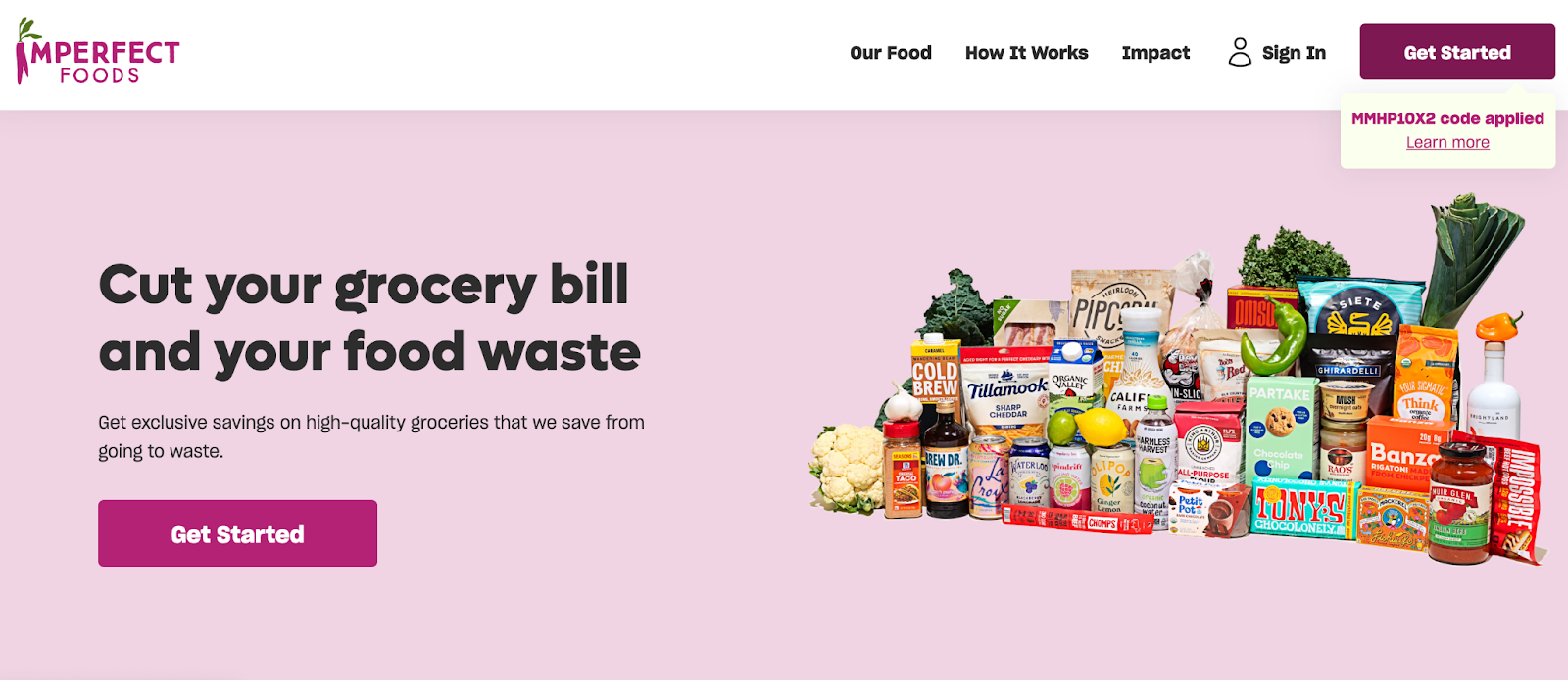
Why it works: Imperfect Foods cleverly repurposed existing assets, saving time and budget while maintaining visual cohesion across online ads and billboards.
Key Lesson: Reduce, reuse, and recycle. Repurposing assets across mediums maximizes ROI while maintaining consistency.

Why it works: To promote unique destinations, they created templates that showcased high-quality images effortlessly while allowing room for localized content.
Key Lesson: Build customizable templates for large-scale operations to ensure every piece feels fresh while aligned with your brand.

Why it works: SALT distilled technical concepts, like cryptocurrency-backed loans, into engaging, digestible visuals.
Key Lesson: If you can't break down your visuals into simple, strong imagery, you risk confusing your audience.

Why it works: Mitto stripped their design system down to its essentials, focusing on only a few key visual elements. This reduced turnaround time for campaigns while maintaining brand integrity.
Key Lesson: A focused design identity is your foundation for streamlined graphics that deliver across all media.

Why it works: Brio tailored its designs to meet the emotional and practical expectations of consumers in the health-tech field, conveying trust and reliability.
Key Lesson: Industry-specific design choices, like color palettes conveying trust in healthcare, can make or break the customer’s overall impression.

Why it works: Doodle Labs didn’t shy from bright, vibrant designs in a tech industry saturated with grayscale. They leaned into creativity to separate themselves from the pack.
Key Lesson: Dare to be different. Sometimes bold, unexpected designs stand out the most in a sea of conformity.

Why it works: Outwrite combines SaaS branding with consumer-friendliness, incorporating modern serif typography and approachable design across its interface, web, and promotional materials.
Key Lesson: Consistency combined with adaptability. Seamlessly merge corporate needs with user-friendly aesthetics.
After reviewing these examples, here are the takeaways every designer can follow to create good graphic design in the high-tech industry:
Avoid overcrowding and unnecessary distractions. Visual communication is most effective when it’s clean but impactful.
Combine bold, stylish elements with consistency in branding for maximum effect.
AI tools can accelerate workflows and ensure scalability without compromising on quality.
No rule says you can’t mix and match elements, as long as the result is meaningful.
Know what users expect from your industry and use graphic design to address their needs directly.
Graphic design in the tech industry is no longer just a supporting element; it’s an essential driver of innovation, user engagement, and business success. By embracing these examples, lessons, and trends, you can shape designs that resonate, inspire, and elevate your brand.


.png)