
Dive into the 14 principles of design with examples. Learn how to use emphasis, contrast, unity, and more to create outstanding visuals. Ideal for designers!
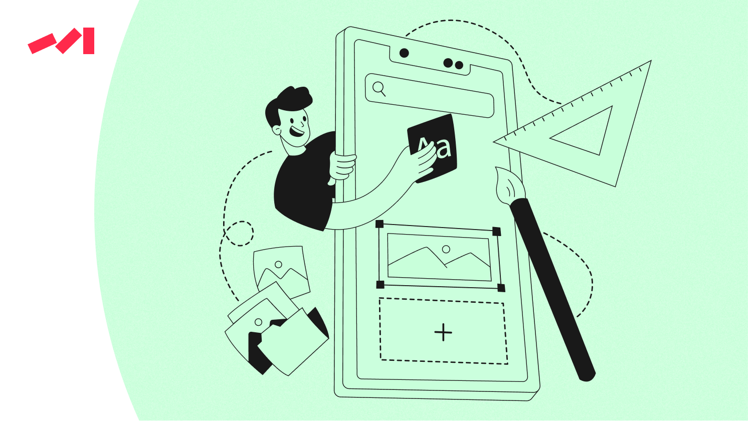
Design isn’t just about making things look good; it’s about creating visual harmony and effectively communicating your message. Whether you're crafting a stunning website, developing a user-friendly app, or designing the cover of your next project, the principles of design act as a guide to showcase your creativity while maintaining structure.
But what are the principles of design? And how can you apply them to take your work to the next level? This guide introduces the 14 core design principles, breaking each one down with examples to help you create engaging and professional designs.
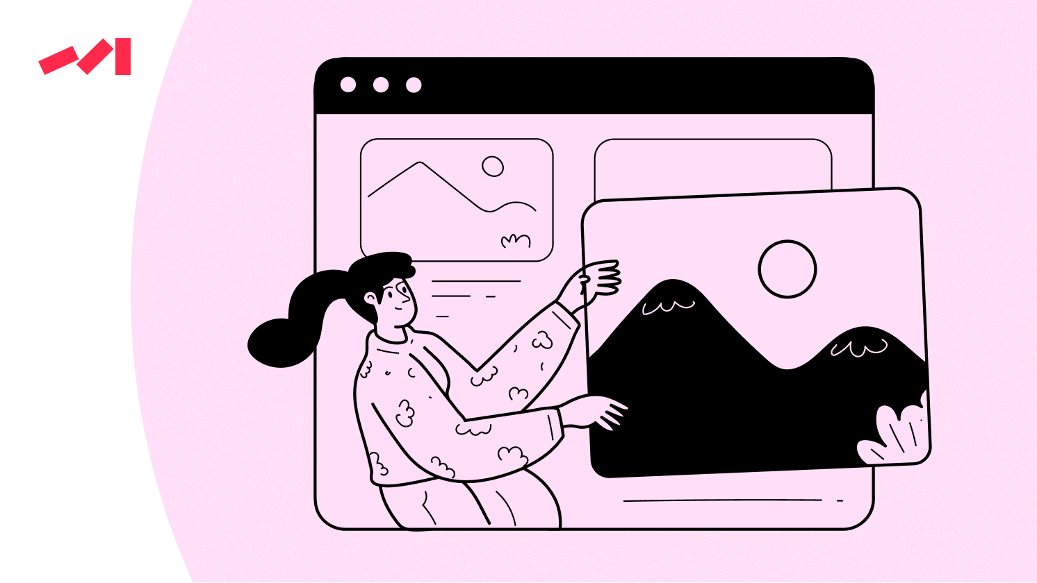
Transform your website with effective design principles and elevate your creative process.


To create impact, you need to know what you want people to notice first.
Emphasis ensures the most important element of your design stands out, guiding the viewer's eye. This can be achieved through size, color, placement, or contrast.
Picture a website homepage where the call-to-action (CTA) button is a bold, bright orange surrounded by muted gray text. The orange button immediately pulls the viewer’s attention—not by accident, but by design.
94% of first impressions are design-related, meaning proper emphasis can make or break user engagement
A chaotic design distracts your audience from understanding the message.
Balance ensures that visual elements are evenly distributed, creating a sense of stability. Alignment ensures elements are visually connected, making the design coherent and organized.
Think of a magazine spread. If the images are large on one side and the text block dominates the other, the balance might feel off unless something ties the two sections together. Symmetrical or asymmetrical balance can help maintain harmony.
Contrast isn’t just about black versus white; it’s the magic that brings excitement to your design.
Contrast happens when two or more elements in a design are different. These differences make the design dynamic while offering visual cues about the content hierarchy.
Consider how a bold headline in black pops when placed against a white background. Or an orange button against a dark navy background. It’s all in the contrast.
Repetition ties your design together and reinforces consistency.
By repeating visual elements such as color, typography, or shapes, repetition creates a unified design that emphasizes your brand identity.
A brand logo doesn't change with every touchpoint for a reason. The consistent repetition of colors in a website header, footer, and buttons helps create a cohesive look.
Start applying the principle of repetition today and strengthen your brand’s identity
Proportion determines the scale and relationship between the elements in a design.
Proportion ensures that visual elements relate appropriately to one another in size and scale. This relationship guides how the viewer processes information in your design.
A website might feature a large product photo with smaller supporting text underneath it. This hierarchy of size naturally draws your attention to the photo first, as intended.
Movement guides your viewers as they visually "travel" through a design.
Movement refers to the path your eyes follow across the design, created through placement, directional lines, or shapes that create flow.
Imagine a landing page where a zigzag pattern of text and images creates a seamless story. The viewer's eye naturally follows the path you’ve set.
Don't underestimate the power of what isn't there.
Commonly misunderstood, white space (or negative space) is the unused space surrounding design elements. This gives your work breathing room and prevents it from feeling cluttered.
Minimalist websites, like Apple's product pages, rely on white space to highlight their products, keeping the overall design simple and elegant.
Not every element is equally important, and hierarchy makes that clear.
Hierarchy is the order in which visual elements are perceived. It helps guide viewers through the content by showing them what to focus on first, second, and so on.
A blog post headline in large, bold font is followed by subheadings in a smaller size, with body text being the smallest. This structure ensures the headline grabs attention first.
Good design feels coherent, not disconnected.
Unity ensures that all elements within your design feel like they belong together. Consistent styles, themes, and alignment help create unity.
A brand’s color scheme carried across its logo, website, and marketing materials ties all visuals together seamlessly.
Keep your audience engaged with just the right amount of variety.
While unity is important, too much similarity can make a design boring. Variety, on the other hand, keeps things intriguing by introducing contrasts in color, texture, or fonts without going overboard.
A website with consistent colors but varying textures and button styles demonstrates variety wisely.
Harmony makes a design more visually appealing by combining related elements.
It’s the relationship between elements that are similar in form, color, or shape, creating a sense of agreement.
A portfolio design showcasing pastel colors and soft-rounded typography demonstrates that harmonious designs evoke calmness and appeal.
Looking at the big (and small) picture helps drive your message home.
Scale is another word for relative size. It’s all about drawing attention to the most critical elements by making them either big, bold, or, in the case of something delicate, small and intentional.
Think of poster designs where the event name stands out in massive text, followed by the date in much smaller font size.
Rhythm puts your design in motion.
Rhythm in design builds patterns or sequences that lead the viewer's eyes through the work, keeping them engaged.
Alternating a series of text blocks and images on a webpage creates rhythm, which encourages viewers to scroll.
Pattern repeats elements for emphasis and visual interest.
Pattern refers to the deliberate repetition of designs, forming recognizable visual textures.
Wallpaper designs and branded packaging often leverage patterns to add style and memorability.
Mastering these 14 principles of design is the key to creating effective, visually striking work. Whether you're a graphic designer, web developer, or design student, understanding how to balance elements like contrast, hierarchy, and movement will help you make informed design choices.


.png)


